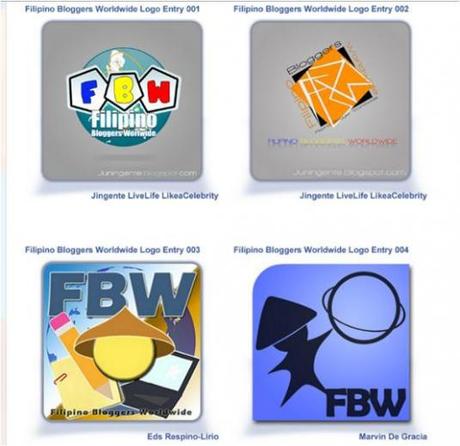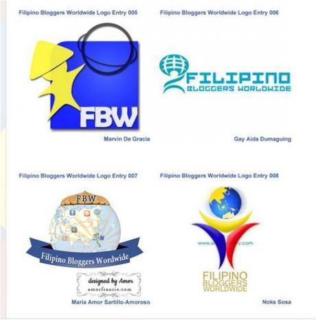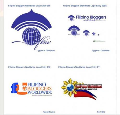
The Filipino Bloggers Worldwide Logo Design Contest has finally reached its deadline of submission of entries last June 20. It is now time to vote for our chosen entry among the 11 beautiful designs submitted by participants to the contest. FBW would like to thank all of the participants who took the time and effort to join the competition. We now have to choose and vote for the entry who would win the following: 1 year domain, property rights of the logo, featured blogger (to earn fame and recognition), plus the $45 cash prize!
FBW member bloggers are encouraged to vote because the best commenter, who would vote for his chosen entry and state the reason why, would also win a $15 cash prize!
The 11 submitted Logo Design Entries can be found below this blog post (way down below) or see them here.
Voting Rules:
1. The participants automatically has one personal vote already on their own design.
2. Votes of Anonymous commenters would not be counted.
3. Voting is from June 21 up to June 30 only.
Rules and Guidelines for Logo Design can be found here!
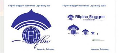
Logo entry number 9, submitted by Jyppe A. Quidores, gets my vote!
The logo may look simple but it is the most illustrative and meaningful compared to all the other entries. It is intricate yet straight-forward enough to define exactly what the Filipino Bloggers Worldwide (FBW) site is all about: A virtually-connected world where all Filipino bloggers all over the globe can unite as one.
Let me enumerate some of the most distinguishable factors of the logo that makes it stand out among the rest:
1. The logo’s intended meaning can be easily discerned and appreciated by most individuals.”Filipino” is represented by the salakot, “Bloggers” by the wi-fi or network connectivity symbol, and “Worldwide” by the globe.
2. Our focus is not severely disoriented by several fancy colors and other distracting images found on the other logo entries. A good logo does not need to clutter itself with too many decorative highlights, but needs to enforce more significance.
3. Filipinos can easily identify with the logo since the “salakot” has been one of the most common symbols of Filipino identity. The “salakot” is the traditional wide-brimmed headgear of the Filipino. It is often portrayed as the hat worn by Juan de la Cruz, the symbol of the collective Filipino psyche equivalent to Uncle Sam of the Americans.
4. The logo contains a globe with grid lines. A grid is a network of uniformly spaced horizontal and perpendicular lines specifically used for locating points (as on a map, chart or aerial photograph) by means of a system of coordinates.In other words, we are speaking about an intelligent geometric pattern into which, theoretically, the Earth and its energies are organized. That is what we want the site to achieve: to be able to easily find each other and combine our “energies” for the good of all.
5. The logo implies that we are all connected. Whether wired, as illustrated by the elegant script style font (synonymous to network cables) of the FBW lettering, or via wireless as illustrated by the wi-fi signal symbol under the “salakot.” Regardless of how we are connected, it signifies the almost non-stop and continuous connectivity our site wants to achieve.
6. The logo is “catchy” enough to attract attention, and meaningful enough to be remembered. You could even easily sketch or describe it for others to easily comprehend.
There are so many logos out there but the most successful in the “recall factor” are those that are simple yet depict a deeper meaning. If I were to create a logo for anybody, I would craft it out from the most vital pieces of information that would best define our goals, intentions and commitment. Without a doubt, the logo has all the factors necessary to clearly send its message across.
Mabuhay to logo entry number 9!
Jyppe, a Graphics Designer and Visual Artist based from his Blogger profile, also commented and explained his design:
“In times like this, siyempre dapat ‘love your own’. Hahaha!
Since I automatically have 1 vote for ENTRY 009, all I need to do is to explain the design.
As far as I understand, the ultimate goal of the Filipino Bloggers Worldwide (FBW) is:
To provide a place where every Filipino bloggers from the different corners of the world can have a virtual meetup for networking purposes; wherein, regardless of what niche they belong, they can share their valuable contents and help other Filipino bloggers achieve their respective vision, mission and goals.
Putting this idea into a compact visual representation, a logo, we need some symbols to represent the individual parts without destroying the whole thought of the objective.
» SYMBOLISM
Before we can pick representing symbols, we need to identify first some keywords, which are NETWORKING, FILIPINO, WORLDWIDE, and UNITY.
Here are the symbols being used in the logo:
Network Symbol. The original symbol of ‘network’ is a dot with three curve line above in a progressive length. This is being used because bloggers, generally speaking, only get connected through the Internet. This serves as an avenue for an online networking and a portal for offline networking.
World. Representing the vast coverage of Filipino presence, both online and offline.
Script Style Font. The continuity of the font style represents unity among Filipino bloggers.
Salakot. Perhaps, everyone of us knows that it is one of the well-known symbol for ‘Filipino”. Even before umbrella become known to Filipinos, salakot is used for the same purpose. It is placed on the top portion of the logo to illustrate that the FBW is like a ‘home’ for Filipino bloggers.
» THE COLOR
As part of branding, ‘science fiction blue’ is the name of the logo’s color. It is one of the futuristic colors. This color is selected because it represents the digital and virtual world and the unfathomable ideas and creativity of every Filipino bloggers. Its RBG value is 13,33, 119 or #0D2177.
» USABILITY OF THE DESIGN
The ENTRY No. 009 is designed with consideration to it’s flexibility and usability.
The logo can be used for the following purposes while having the same identity :
1. Blog Header. The emblem can be 70x70px and the whole banner is best at 500px width, as shown in the illustration.
2. FB Group Cover Image. The logo with Filipino Bloggers Worldwide wording can be used for both cover image and blog banner.
3. Profile Image. The logo is a combination of both fine and bold elements, which make it pleasing for large and small sizes.
4. Favicon. The logo is still recognizable at the minimum of 16x16px, favicon size.
5. Avatar. It is also suitable for a 50x50px avatar.
6. Printed Materials. The logo is still crisp at minimum of 1.5X1.5cm, the common size of a logo on a business card. Since it is monochromatic, it is easily printed in any color.
7. Stamp. We don’t know how far FBW can go, but we look forward that this will become bigger which the organization will even need stamp.
8. Color Conversion. In event the the logo is used in darker backgrounds, the whole logo can be easily converted into white.
FINAL THOUGHTS: Wala na. Hehe!”
Below is Jyppe’s website: The Creativity Window (It’s right brain’s view)

MY THOUGHTS:
Good luck to Jyppe, …..and also to the rest of the entries.
Jyppe’s logo design has stayed away from the usual blue, red and yellow flag colors and symbols commonly used to depict nationalism or being a Filipino. The said images are way too overused and abused already that seeing them in most Filipino-themed logos makes them all look one and the same already.
Being a Graphics Designer and Visual Artist seems to be to Jyppe’s advantage since he was able to technically conceive, define and produce what really needs to be incorporated in a logo to make it successful.
The entire list of entries to the competition can be found below:
