I could never live off the grid. Indoor plumbing, a refrigerator, microwave, air conditioning and my flat iron are all too important to me. I know ease of living and vanity are hell on the environment. And by the time, that old pine box with my name on it calls me home, I suspect my carbon footprint will be large enough for children to swim in it, providing if there’s any safe, clean water left anywhere in the world when my time comes.
Yes, my little tree- huggers, I WILL try harder.
And will do so by recycling more, walking more, dry cleaning less, hang drying my wet clothes more often AND telling you all about my new love affair with the color green. Or to be more specific, two particular shades of green: celadon and green yellow.
Celadon is shade that’s more green than anything. A nice, calming hue to be sure. It used to be everywhere back in the early to mid 80′s. These were the “Miami Vice” and “Dynasty” years, so women were always traipsing around in clothing that hid shoulder pads as big as a baby bed mattress and the men would wear round collar t-shirts under a suit jacket and sockless…always sockless. Their rooms were all decked out in this shade of green mixed with peach shiny lacquer furniture. Rounded corners. You’d find decorative borders adorning the ceiling line.
Remember this?
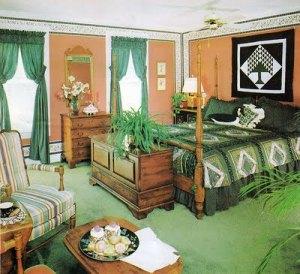
Pic courtesy of Huffposthome.com, by the way.
See what I was talking about in terms of color combos? Peach and various shades of green. And why were there so many ferns in every room back then?
I couldn’t sleep in a room like this today. Doing so I think, would actually give me ADD. The heavy furniture would make me feel claustrophobic and the quilt effect of the comforter would make me yearn for corn pone and discovering ways to sign up for FarmersOnly.com.
Furniture must also have a lightness of being, I think. This isn’t it and oh my Deity, look at the hideous 80′s wallpaper border along the ceiling line AND baseboards!!!!!!
Oh the pain, the pain……
But back to my new found respect of green. For the first time ever in my life, I like green-yellow. Back in the day, this at was my least favorite color in crayon in Crayola’s box of 64. Here’s why: I’m the baby of my family, but I had younger cousins. I remember when they were fresh out of the womb and watching their diapers being changed. I stood here both repulsed AND convinced the Infamil formula they had for supper was performing som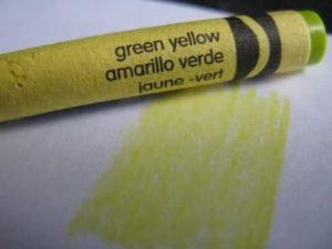 e sort of strange alchemy in babies’ stomachs. The stuff they drank went in white and liquid—I saws the bottle myself, but a short time later, came out greenish- yellow and liquid. And the smell? That particular smell was almost palpable.
As a result, I was turned by that color off forever.
Besides, the crayon itself was only good for coloring squash and how many times did squash come up in any coloring book, unless its one produced Burpees Seeds or Martha Stewart on a gardening bender?
And might I add, this is the first time I’ve looked at a crayon in years. It’s multi-lingual!!! How urbane. But what a great teaching tool, as well. More on green-yellow in the next week.
So anyway, I decided a few years ago to bring back celadon….in moderation, of course.
First, I found this cream colored mid-century chest, total reproduction (it would probably melt if left out in the sun long enough) but it was so cool, I had to bring it home with me. I grew up in the 60′s, so I saw lots of this style. I didn’t appreciate it then, I do now.
I put it in the corner of my great room, next to some built ins.

I forgot where the art work is from or what its called or who the artist is, but i liked it because it reminded of the Earth’s layers.
When I placed the cream colored chest underneath it, I noticed how much that brought out the lighter tones . So, I found this big round glass plate in pure Don Johnson 80′s celadon and placed it on a bronze stand.
But needed more. A statue or something and just the right dimensions.
A friend suggested I use Venus de Milo, but I sad “Nah, everyone has Venus somewhere in their home. I want someone few people have”. I remembered seeing this headless, arm less angel somewhere and thought it had a cool art- deco vibe about it. So, while perusing a website for the famed Louvre in Paris, there she was.
The Winged Victory of Samothrace (AKA the Nike of Samothrace ) is a 2nd-century BC marble sculpture and pure Greek. Excavators believe she formed part of the Samorthace Temple Complex dedicated to the Great gods, Megaloi Theoi, whoever they are. It’s been prominently displayed at the famed Paris museum since 1884 . Experts say it represents a near perfect example of Hellenistic sculpting.
Yeah maybe, but what about her head and arms?
No one knows where those are, but various other fragments have since been found Nike;’s initial unearthing in 1863. Almost 100 years later in 1950, excavators found her missing right hand, but it was fingerless and check this out….it slid out from under a rock where the statue had originally stood. Out of nowhere. Right in front of the scientists. Poof!!!!! It just slid on out, as if wanting to be found.
A subsequent dig at the temple coughed up the Goddess’s ring finger and her thumb. Both are kept in a special drawer at a museum with a very difficult to pronounce Teutonic name, in Vienna, I think. For those who are curious and with plenty of time on their hands, here’s a hint: the name begins with a “K”….maybe. Not sure.
Fast forward to 2014 for a gander of the glass plate and Nike in the corner of my living room.

You cant see it in this pic, but in the painting above it, there’s a lovely celadon green veining that just makes the plate pop and when you mix the statue with it (which is just bronze paint over plaster, but quite pleasing visually), it offers a tremendous overall effect. , I think. The plate’s goldish-bronze painted accents tie everything together..
I then chose to place a tall mid century floor lamp next to it with this oversized post modern shade that I’m sure t Sally Rogers wouldhave sat near during one of of Rob and Laura’s many parties for Alan Brady and well, there you go.
If memory serves, this entire to homage to the color green, Greeks and Geeky mid-century was well under $300. And while it might not be your taste, that’s fine. It’s not mine either. At least it wasn’t. I basically copied it from various design mags and websites. How do you know what you like –and don’t like unless you investigate? Do a little digging….R&D? And besides, isn’t copying in this way, the penultimate form of flattery? I think so.
I like it, it makes me comfortable. And that too is the essence of one’s own style. Find what you like. Screw what anyone else thinks.
I really like the warmth of the painting, married with the cool, aloofness of the chest. Then there’s that lovely plate with ol’ arm less Nike standing up there without a head, completely unaware of the vast design mistakes I’m making on the other side of the room.
Seeing here in her French element is on my bucket list and just as soon as Americans are better received around world and the terrorist develop lousier aim, I am so going to Paris.
Until then, join me soon for more questionably tasteless ventures down Style Street.
Tootles.
PS: I really, really want shoulder pads to make a comeback.
