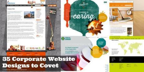
Who says corporate websites are boring!
They can be colourful, graphical, artistic and stands out from their competitors’ websites.
Here is my image intensive compilation of 35 corporate website design from Singapore local companies and international big MNCs ranging from various industries.
I have categorised into 5 groups.
- Layout
- Background
- Typography
- Graphic
- Colours
1) Layout
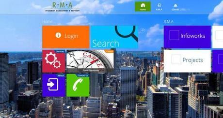
Like the Windows 8 layout style. Website.
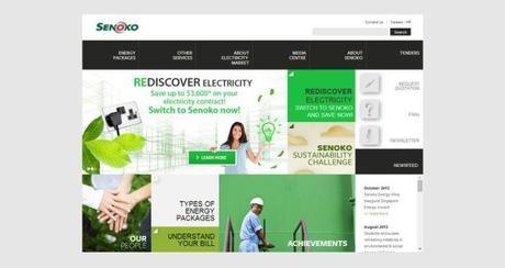
Another Windows 8 layout style. Love the angular squares & rectangle. Website.
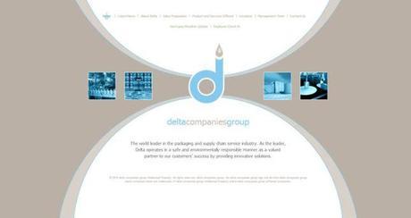
I like the unique circle design element. Link.
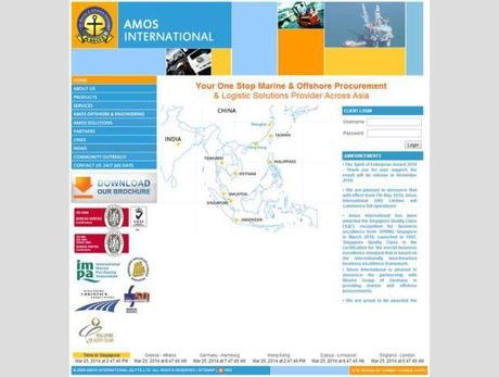
Love its colours and squarish style. Like an old art movement. Link.
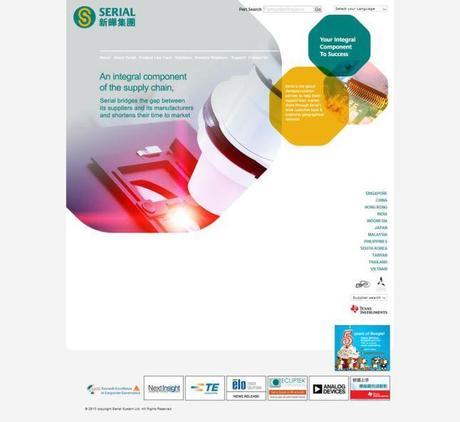
Another corporate site that uses round corner octagan to hold its content. Link.
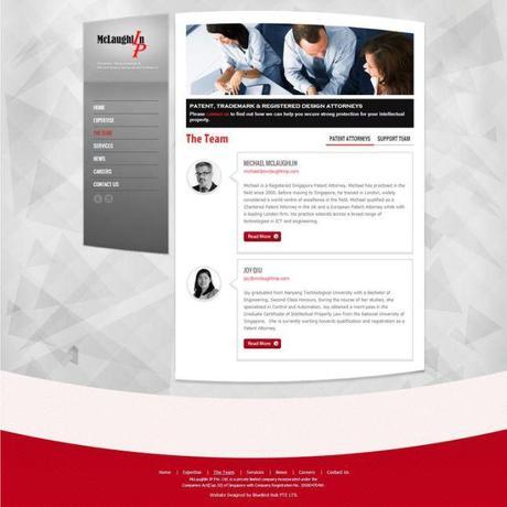
Shapey layout. I can’t resist geometry background. And I like the dialog cloud used to describe the management team. Link.
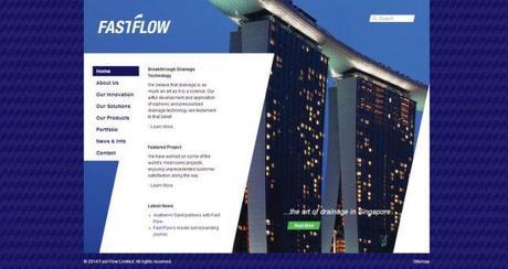
Great use of “7″ as design element. Link.
2) Background
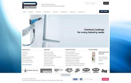
I like the swirling abstract background. Website.
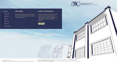
Great illustrated background and elegant blue color scheme. Link.
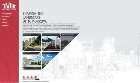
I always like website using illustration as background. Great color scheme. Link.
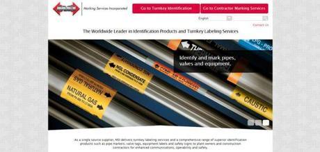
Like the arrow dotted background. Website.
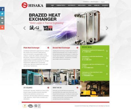
Must pin this website design as I always have a thing on the geometry gray background. The background fades to white as the page scroll. Link.
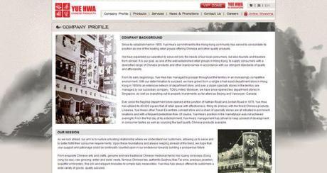
Chinese painting style background really matches its brand oriental image. Link.
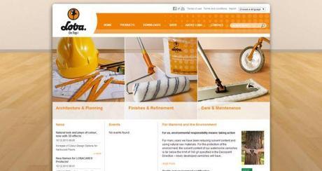
A company specialise on paints and home furnishing. Like their background which reference to their company specialty. Link.
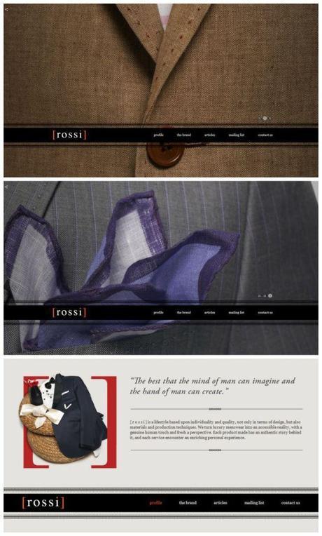
Sleek layout with beautiful hi-resolution photograph backgrounds. Like the menu graphic. Link.
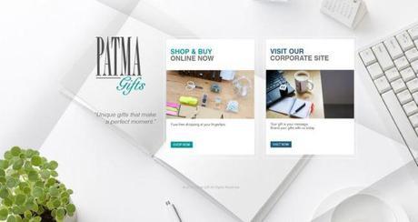
How I wish the company has used this background throughout their corporate. Really fave the background. This page only serves as an introduction site to redirect to their two specialty sites. Link.
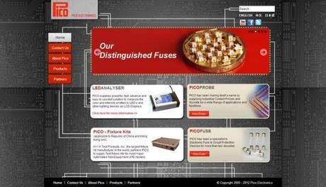
A special background that brings out the great layout. Interesting lines linking all the content. Link.
This site features an animated textured background. I like the lighting moves around to reflect the company name. However, not sure how to access the site as there is no links or other info. Link.
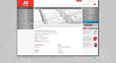
One of my favorite background style. Simple gray background with white sketches. Link.
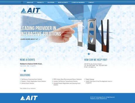
I like the triangle patterned background. Link.
3) Typography
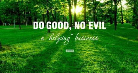
Large photograph background. Great typography. Link.
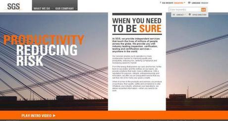
Strong color contrast against the big photo background. Great typography and layout. Link.
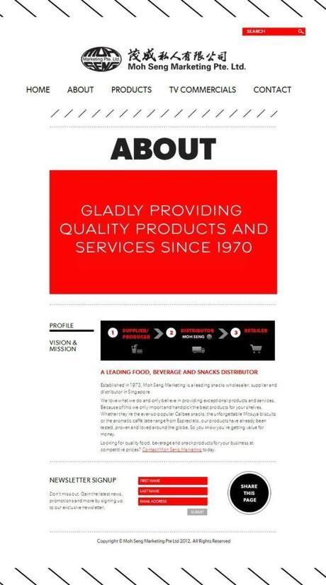
Great typography, layout and color scheme. Simple yet straightforward. Link.
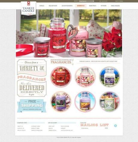
Vintage cosy style web design with complementary matching fonts. Great typography style. Link.
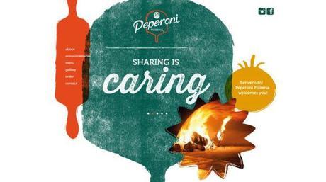
Printmaking style of pizza maker kitchen utensils. Great choice of typography. Link.
4) Graphic
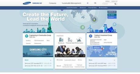
Love the colours of the cityscape illustration. Website.
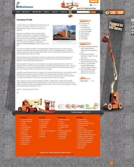
A rustic style for a construction company website. Matching orange, white & gray color scheme. I like the crane and machinery images at the right of body and footer. Effective use of graphic with “Request for Site Survey” title. Link.

Diagonal stripes on background graphics. Make the image more interesting. Like the overall layout with 3 column style. Link.
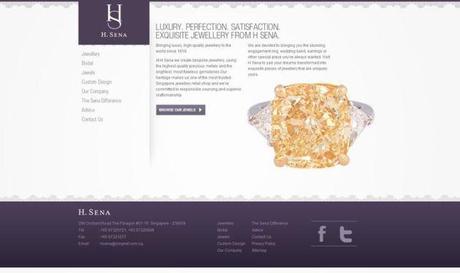
Like this romantic purple lace border for a jewelry website. Link.
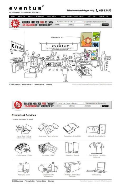
Love the doodles style. Link.
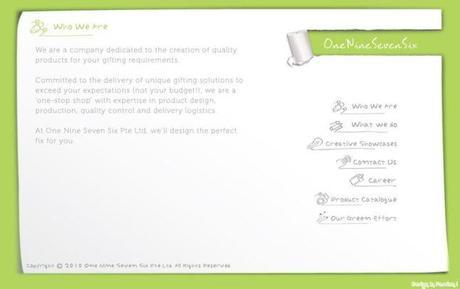
Love the paper texture and the paper tear effect. Link.
5) Colours
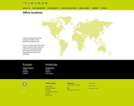
I like the bright green accent color. Great color scheme of green, white & black. I like the map graphic too. Link.
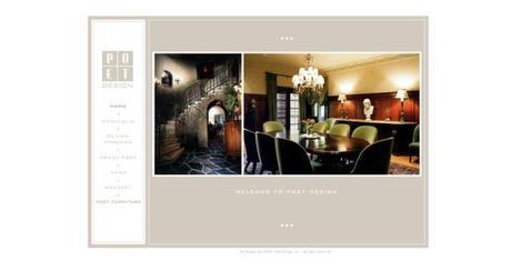
Like their logo, simply color scheme which make the site looks very elegant for a interior design company. Link.
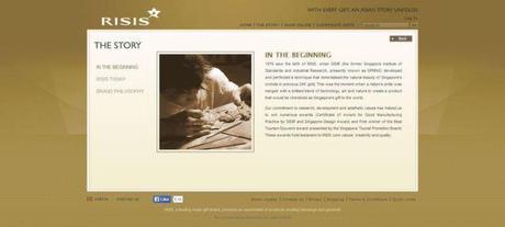
Abstract style background and an unusual color scheme. Link.
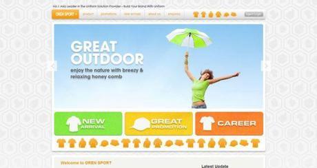
Love the colourful graphic and the garment clipart style background. Link.
Browse my previous compilation of 15 Corporate Website Designs I Like. Find more website design inspiration at my Pinterest board, - web -.
>>>>> Thanks for visiting! <<<<<
alittletypical is on facebook | pinterest| instagram | bloglovin | shop
