Planning your perfect bathroom is an exciting project. There are so many chic bathroom products and elegant accessories on offer (Ideal Standard have a wonderful range) it is easy to get carried away with what you need in your perfect bathroom. However, it is important to make sure you get the colour scheme right for your room. You need your bathroom to be somewhere you are comfortable in, that puts you in a good mood as invariably you will spend time in it every morning. Make sure you have a color scheme which is in style and will also look good in the years to come (or at least plan in way that you can make adjustments to the scheme later down the line).
Small Bathrooms
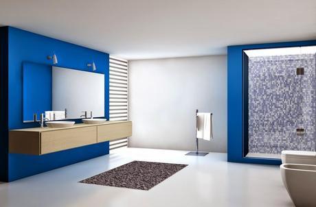
If you are dealing with a small space you will want to design the bathroom in such a way to give it the illusion of roominess. One way to do this is to install a large mirror in the room. White is the go-to color to give a spacious feel to a room but you may also want to add warming colours to the design.
Trends for 2015

Bright bold blues will be in for 2015. Add splashes of Mediterranean blue by installing units or accessories which are reminiscent of Greek seaside homes and pair with greys and pinks. Pastel palettes which take you back to 1980s LA will also make a comeback in the year ahead. Olive green is a shade which is quite a safe bet whatever year if used sparingly.
Neutral Colours
Neutral colours fit the bill for the last two criteria. They are on trend for 2015 and help a room appear bigger. A combination of two neutral colours such as gray and white can provide an atmosphere of calm. Include patterns to avoid too mundane a look.
Tiles

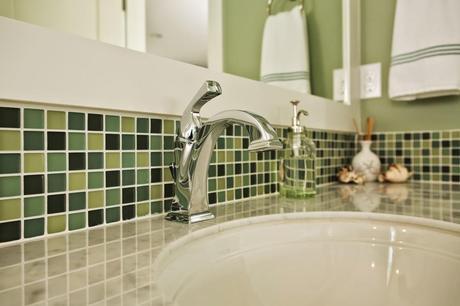
Tiles are a great way to get interesting color schemes into your bathroom. A tiled feature wall can really stand out and give a bathroom real character in an otherwise neutral color scheme. A wall of mosaic tiles in different shades of green, pastels or deep blues can each offer a different but relaxing vibe to a bathroom.
Relaxation v Energising
Bright bursts of colours can be a real mood lifter first thing in a morning, however, be careful when choosing colours for such a scheme. You need to be sure you’ll be happy with bold bright colours for the next few years as there is a real chance they could soon look garish and out of fashion. More muted relaxing colours can look both stylish and modern but conversely look dull after a year or two.
If you enjoy my blog, please consider following me on Bloglovin'
