Text
DIOR haute couture 2011 my commentary
Each comment corrisponds with the photos directly below.
Below: geometric/architectural style whilst staying true to the Dior look
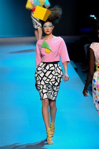
Below: Marroccan style gone wrong, with cheap surface decoration and bad wig.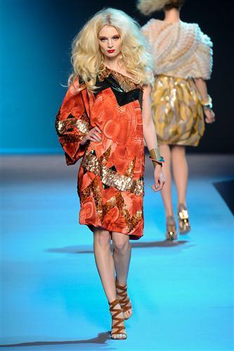
Below: HELLO UGLY!!! - could that print and colour mix be more ugly? or further from the Dior spirit?
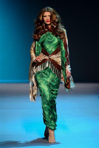
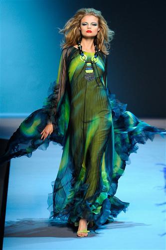
I actually kind of like both of these dresses, but talking from a best of a bad bunch perspective. The first one looks suspiciously like a Roberto Cavalli though.
The make up and hair however, is Very Dior. I happen to have chosen some of the best pieces of the collection, but can you see the lack of coherence in the silhouette even?
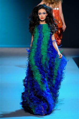
NOW!!! These 2 look like Dior was struggeling on a budget and had to make do with left over fabric scraps. And whats with the clown hat? there were some very strange starry head-peices too…wheres the story?
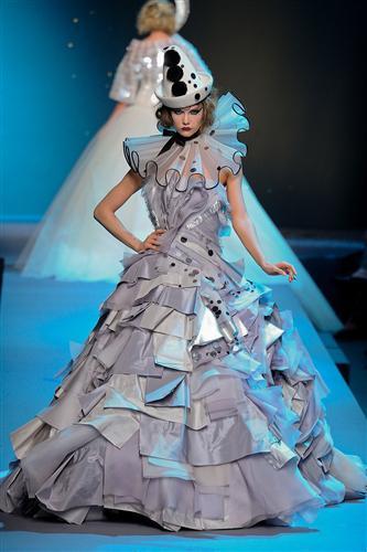
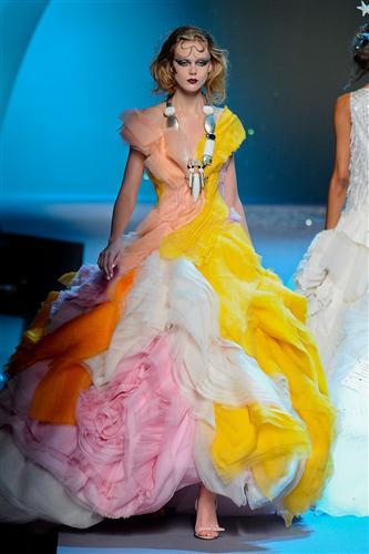
So now you can see what i meant when i wrote my review earlier huh? Hurry up Dior and get a new designer before your team really loses it.
xoxo LLM
(Source: fashionista.com)

