Today is Monday but I am not experiencing any Monday blues. I am feeling very excited because I can’t wait for my blogskin change tomorrow.
A few weeks ago, I have been scouring the internet for website inspiration. Then spending days and days on making the background and header. Until now, I am still testing the graphics on my another site made private.
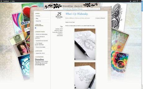
I have to thank Stacey, blogger of DoodleSwirl for sparking my inspiration. Below is a screenshot of her web layout. Beautiful, isn’t it? You might think she is using a Premium theme or a theme with Custom Design Upgrade. However, she is only using the elegant and simple Chateau theme. Quite amazing to spend not a dollar to transform a free WordPress theme into something so amazing. I like the showcase of her works, photos and what she likes at the background which really tells a lot about the site owner. Great use of layering graphics. She also uses a gradual gradient effect for her background which allow the graphic background to blend with the main body colour.
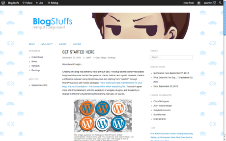
Another interesting blog design is from Samuel. I like the mellow or whatever facial expression on the header. Also you can see his gamer side from the pixel monsters background used. Consistent colour scheme is applied throughout the site. The WordPress theme he uses is Oxygen.
Here are some other website inspirations from my Pinboard.
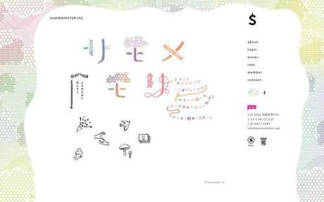
I love the colourful geometry background. The curves used make a pretty border around the content.
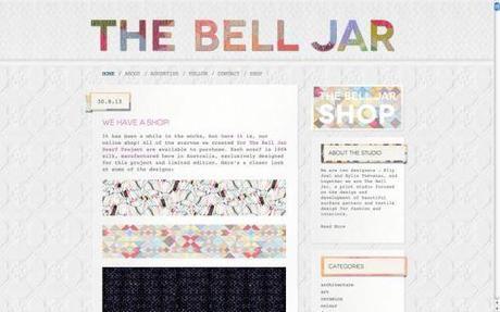
Beautiful header and great textured background used.
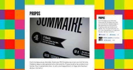
Eye-catching background. From VITEUNGRAPHISTE.
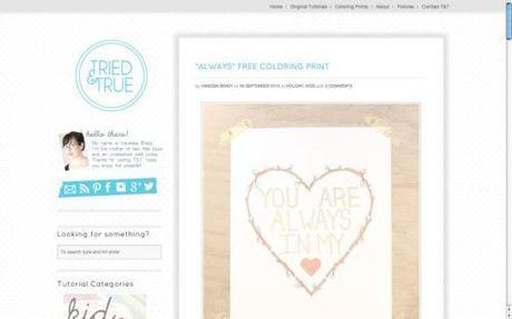
Great use of texture and pattern. I like the border around the main body.
I really like how Stacey and Samuel have put in an effort to make their sites stand out. You may notice there are many WordPress sites still using the same header provided from the free theme. Their “about” pages are empty and the usual widgets appearing at the same positions at the sidebar/footer. I like how your blog design represents your personality. It tells the readers what your blog is about.
So, I am thinking of creating a weekly post about beautiful blogs using free WordPress theme. Do leave a comment if your blog has a great design. It can be your own designed header/banner/buttons; attractive backgrounds; pretty social media icons.
Related articles
