Plan with purpose. It sounds simple, but that's all you really need to do. Every element, color and font in a minimalist design project needs to have a reason to be included.
Start your project with a goal. What are people who interact with the design supposed to do with it? How do you get them there? While this sounds simple, it can be a little more complicated than you think. And it might require you to throw away common design elements.
Minimalism is about a return to the basics of contrast, space, organization, color, dominant visual and typography.
Contrast: Black and white schemes are popular because they innately contain a lot of contrast between elements. But any high-level contrast works. Use yin and yang concepts to pair elements with opposing forces - large and small text or images, open space and a single element, other colors with plenty of contrast, stark design with an elaborate typeface.
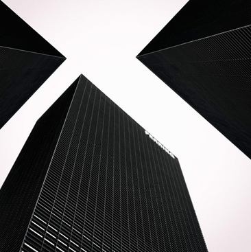
Space: Minimalism is built on space, and while you don't have to include massive amounts of white space, element breathability is a must. Each piece in the design puzzle must have room to stand on its own in the design. Minimal outlines seldom feel cramped and work.
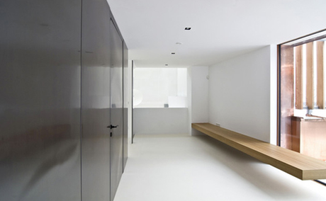
Organization: Please use a grid. Go back to some of the roots of minimalism and the use of lines and rectangles. Even those lines we can see impact how users feel about the design. A grid will keep you organized and your design feeling harmonious.
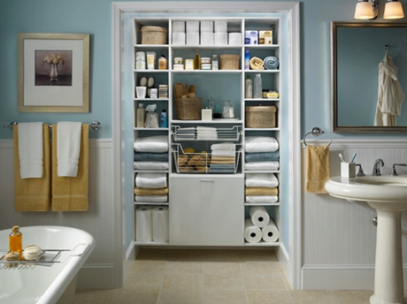
Color: Contrast and color are often lumped together in discussions about minimalist design, but are separate visuals. Color can create contrast, and it is an important part of the planning process. Too many designers trying to go minimal overuse color or think that minimal has to be black and white. The palette should be streamlined; rather than the two- to four- colors from a traditional color scheme, try to stick to a single hue in a light and/or dark framework.

Dominant visual: Don't get caught in the too many visuals trap. Pick one thing and make it dominant (note dominant, not necessarily large). Dominance links directly to contrast to uses the techniques in concert. Suggestions for dominant visuals include an image, block of text or element with surprising color.
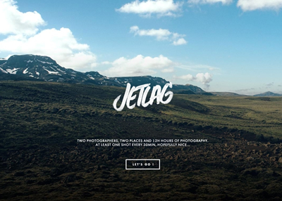
Typography: The common usage in most minimalist frameworks is sans serif typography and that's a great option. Go with a typeface that has clean lines and simple strokes. Bold or thin typefaces are usable, depending on the message you want to convey. If you are using type as the dominant element, consider a typeface with more flourish or personality for contrast.
 Minimalism is one of the design trends that just never gets old. The simplicity of it makes minimalism easy to incorporate into a number of other styles and trends. It is classic and classy. It works with - and emphasizes - many different types of content.
