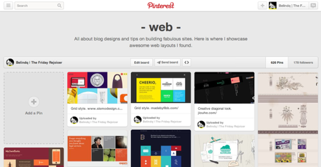
Not sure who started this trend, but grid style design has been all over the internet. Many are using it – Pinterest, Windows Metro UI, Tumblr and many more. For me, I love this design element as it made things look orderly and it is pleasing to eye. Read on to see what I found. Find more webspiration at my Pinterest board.
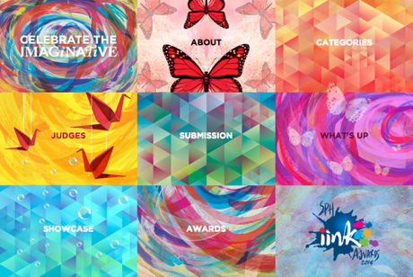
1) SPH iink Awards 2014
Not only the grid design, I like its kaleidoscope style.
-
2) Jonite
Who says grids need to be square!

-
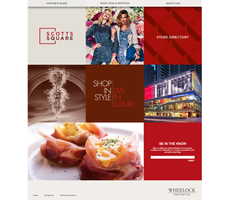
3) Scotts Square
Kind of synchronise with the brand logo.
-
4) Zac Meat
A photo collage style grid. Hover above each image to see the text.

-
5) Zensorium
Neat color scheme.

-
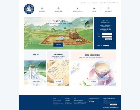
6) Clipper Tea
Love the website watercolour illustration!
 -
-
7) firefish
Simple and clean layout.

-
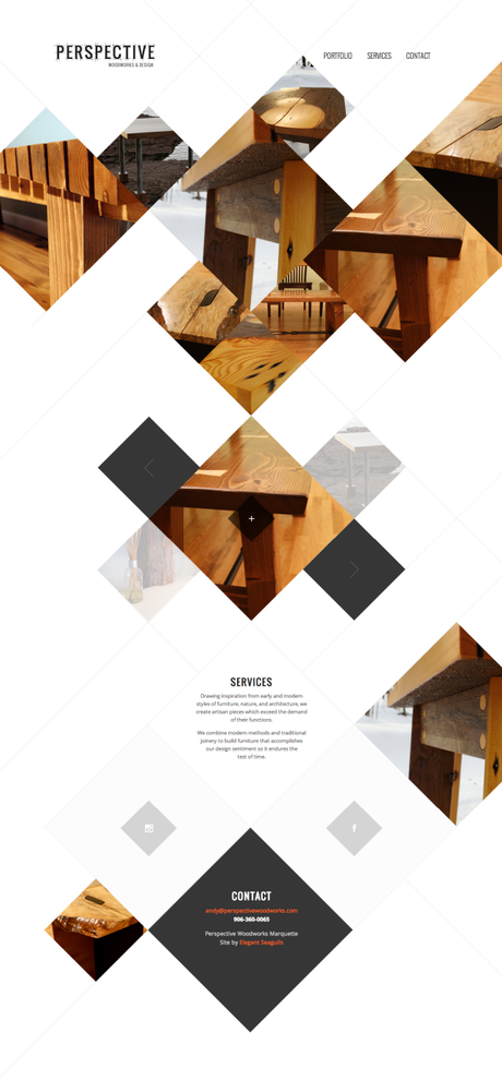
8) Perspective Woodworks & Design
Diagonal square gallery.
-
9) Axiom Law
Best part is the interesting writeup for each page/square.

-
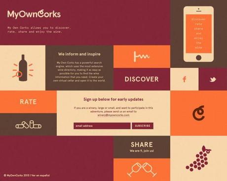
10) My Own Corks
Use of 4 colours and vector art to create this cohesive grid layout.
>>>>> Thanks for visiting! <<<<<
The Friday Rejoicer is on Pinterest| Instagram | Bloglovin | Shop
