 Finally my second post on ideas for customising your blog! Refer to my blogskin page to see my previous blog customisation.
This time the topic is sidebar.
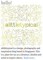 As you see on my sidebar, I have placed a text widget of a square header and a blog summary at the first position. Unlike the usual title “about me”, I uses “hello!’ which is a greeting to my readers. I believe this is important to introduce yourself and what your blog is about to your reader. You can read my previous post for a guide on how to place image and text at the sidebar.
For the sidebar, I recommend to fill it with your social media buttons, your shop/portfolio logo, search engine and popular posts. You can also add other widgets like gravatar profile, newsletter subscription button, blogroll, Instagram gallery, Facebook page, Twitter page and favourite posts etc. It all depends on your priority.
As my current WordPress theme, Pilcrow, has a footer, I keep my sidebar simple and allocate all my other widgets to the footer. So if you have a lot of widgets to add, you can choose WordPress themes that come with 3 columns or footer.
Now below are some of the creative sidebar design to spark your inspiration.
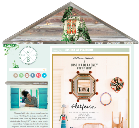
This is so clever! To match with the layout, the blogger’s photo is framed inside a window. Even her portrait matches the whole colour scheme.
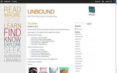
Look at the header at the side. Colourful typography of keywords about the site. You can easily tell what this site is about.
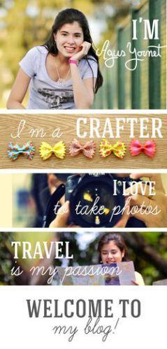
What a graphical way to describe yourself!
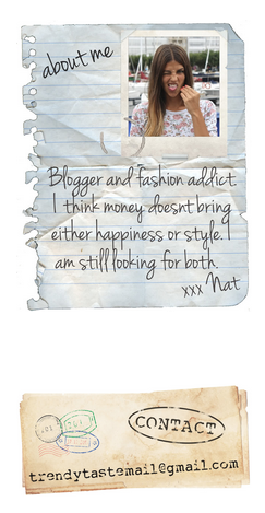
A cute profile. It is made up a torn notebook page and a handwritten font. Even the contact email is drafted like a vintage letter.
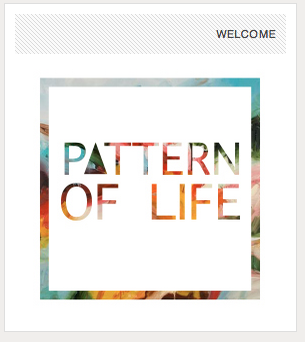
Another header image at the sidebar. Simple yet eye-catching.

Another great use of typography. I like the justified and underlined layout. Added with round black-and-white graphics below. (By the way, the blog is no longer using this typography menu.)
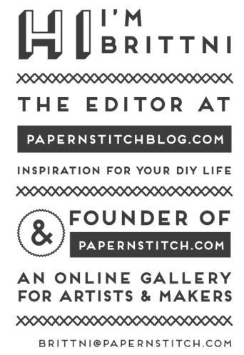
Oh, this is not in the sidebar but the about page. I like the typography style of “About Me”.
