For the past couple of years, I’ve been experimenting with photo-illustrations. I’ve
had a lot of fun, learned some tricks, and I’ve gotten pretty good at them. However, I’ve decided they’re not for me. Why not? Two reasons:
You’re no longer in control. You can’t sketch out a idea, submit it to an art director for approval, and be sure you can create a photo-illustration that matches your sketch.
Rather than just draw what you need, you become dependent on photos. If you can’t find the photos you need (specific subjects, poses), and obtain commercial rights to them, you have to modify your original vision.
And once you’re forced to modify an element in your design, there’s a good chance you’ll need to make other changes. Pretty soon you’re ad-libbing, hoping it will all turn out right somehow.
 Second reason: a commercial illustrator needs a single established style. Ironically perhaps, portfolios with multiple styles foster doubts. An art director needs to be confident that when he gives an illustrator an assignment, the final art will have a certain look: a look consistent with the illustrator’s portfolio.
Does this mean an illustrator can’t experiment with other styles for his own amusement or pleasure? Not at all. Experience has taught me, however, that an illustrator will have more credibility with a single-style portfolio.
Having said all that (rather pompously), here’s my last 2012 photo-illustration experiment. It was done purely for my own amusement. I had only a vague idea of “golfers melting in the sun.” I broke the first rule of illustration by not doing a preliminary sketch, and I ad-libbed my way from start to finish (blush).

Here’s a quick look at how the piece evolved.
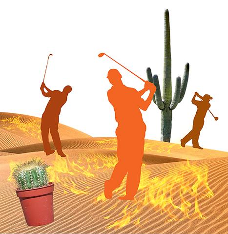
I extracted sands from a desert photo, and pasted in golfer silhouettes that I found
on Stock.XCHNG, a free photo site. Then I pasted in cacti on different layers.
The original silhouettes were black. I dubbed in various “hot” colors.
I extracted flames from a campfire photo, pasted them in, and experimented with different layer blending modes.
I extracted cliffs and a stormy sky from different photos. I made the sky menacing
by filling a separate layer with red and using blending mode = Multiply, which has
a darkening effect.
I used the Warp and Pen tools to distort the silhouettes, and added some additional props. I also enlarged the flames and made them whiter and more transparent.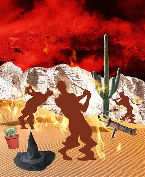
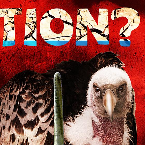
Is that a buzzard or a vulture? I can’t remember. But I must have given him some
growth hormone… 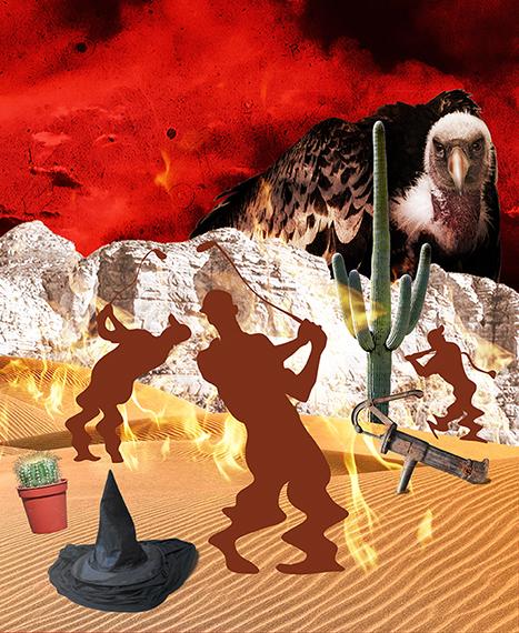
Finally: I added text, pasted in photos of water and dried mud, and used masks and blending modes to give the text a parched look.
I added a top-down gradated “burn” to the silhouettes, and created “cast shadows”
for the golfers and all the props. The shadows help convey the idea that the sun is
beating down. Here’s the final again: 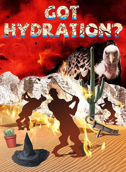
Here’s a close-up of the text. I pasted my “cracked mud” photo over the white text, and
my “water” photo over the mud. I masked out most of the water, then experimented with blending modes and opacity to create the effect of being able to see the mud cracks thru the water.
The bird looks a lot like me when I first get up in the morning…
I found a good photo of a water pump, but it looked too pretty to have been lying out in the desert. So I added corrosion by pasting a “rusty metal” texture above it, and adjusting the blending mode and opacity.
I masked out parts of the pump to partially bury it in the sand.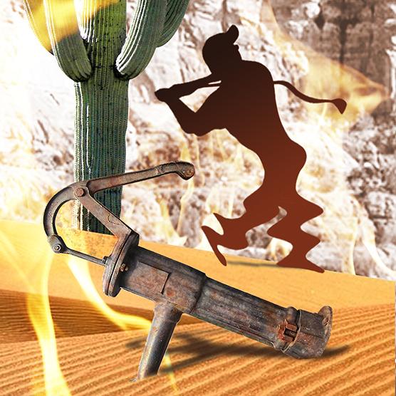
This last detail image shows how the quality of individual photos can differ.
The potted cactus is very sharp, clearly from a high-res (resolution) image. By contrast, the “Wicked Witch puddle” was extracted from a grainy 72 dpi JPEG. I sharpened it and cleaned it up, but alas, there’s only so much one can do with a low-res image.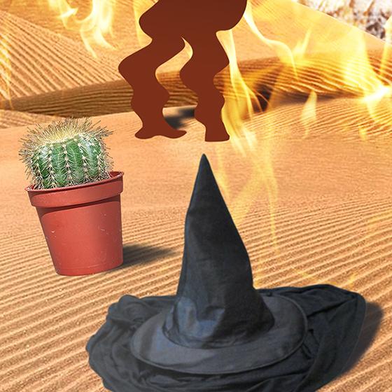

* * * * * * * * * * * * * * * *
Are you a fan of photo-illustrations?
Do you have a portfolio? If so, do you restrict it to a single style?
Did this post make you thirsty??
Hope you’ll leave a comment.
If you enjoyed this post and would like to let me know, please click the Like button below.
If you’d like to share this post with others, please click Tweet or Facebook or one of the other Share buttons.

