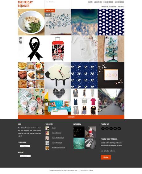
Pictorico. my 9th Wordpress theme since Jun 2014.
I have been using Adelle theme for almost 1 year and it has been getting too comfortable for me. I craved for a change, but was very lazy and indecisive on which theme to choose. There are so many themes and every month there are always new themes to anticipate.
Kelly, Book Lite, Syntax, Illustratr and Editor are many WordPress themes I was pondering to take on. You will notice among the selection, 4 out of 5 are actually one-column themes which are so different from my previous blog themes. I admit I cannot do without sidebars to put all my important widgets like “About Me”. “Social Media Buttons”. “Top Post” and etc. However, I will like to try single column layout so that my readers have less distraction when reading my blog.
That brings to the reason why I pick Pictorico as it has 4-column footer. In the end, I bring all the sidebar widgets to the footer. Another feature I like is the gallery style which has a portfolio feel. It makes my “I Love Series” posts more outstanding. In addition it has the post slider feature to further showcase selected posts.
However, like most WordPress free themes, Pictorico comes with some flaws that took me some time to adapt.
First, “if no featured image is set, a solid background color is shown instead.” As my past themes do not have the need to set featured image, you can imagine how long I take to set featured image to every post. And yes, I have only completed 30 latest posts. What a headache that I’m going to repeat for remaining 200 posts. How I wish Pictorico incorporates Cubic’s smart function, “If your post doesn’t have a featured image but does include images, Cubic will display the first image attached to the post.”
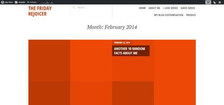
My blog looks empty with red imageless square.
—
Second, hyperlink camouflages with the body text in the black colour scheme. It is nice that Pictorico offers 3 color schemes – Default blue, red and black. However, you can totally omit the black color scheme since you cannot differentiate hyperlink with body text which are both black. You can’t expect readers to hover around to minesweep the links in “I Love Series”.
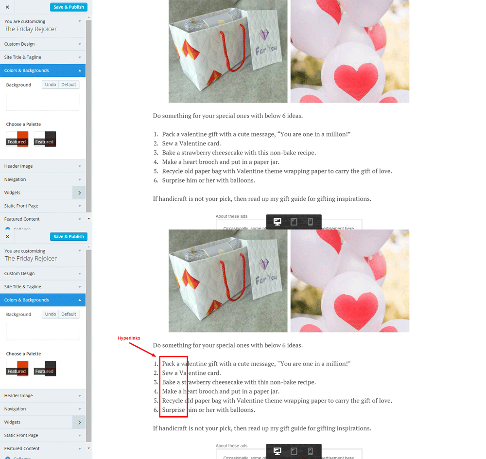
Can you spot the hyperlinks?
—
Third, featured image shown in blog post “work best at a minimum of 1200 wide and 590 high” or else it will be pixelated/ blur. It is a bit difficult for me as my weekly post “I Love Series” features curated artworks and finds all over the internet which are usually small in specs.
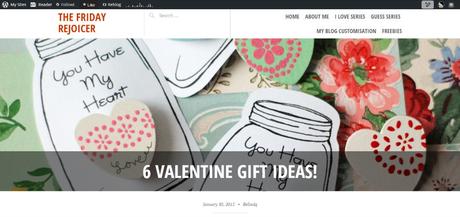
Look unprofessional using blur photo as featured image.
—
Fourth, you can’t choose the alignment of your featured image in the front page and blog post. What if your featured image which is also the signature image of the post follows one-third rule. The essence of the image will be cut away.
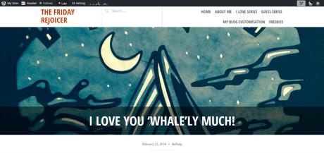
Is this a mountain? Nope, it’s a whale!
—
Pros
- Gallery layout
- Post slider
- 3 color schemes (or 2 color scheme if omits the dysfunctional black color scheme)
- Up to 4 columns for footer
Cons
- Dysfunctional black color scheme
- Required large featured image
- Cannot auto set featured image
To sum up, Pictorico is suitable for photographer and artists who blog with beautiful large photos.
