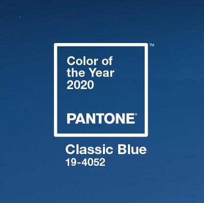
Ahead of the start of the new era with great joy and excitement I am thrilled to share with my readers that the Pantone Color Institute has announced its 2020 Color of the Year. It is PANTONE 19-4052 Classic Blue, a deep blue shade that's at once comforting and relatable.

Like every professional and entrepreneurs I wait for the announcement to take place to understand the market for the next one year and so. As described by Pantone the colour installs calm, confidence, and connection, this enduring blue hue highlights our desire for a dependable and stable foundation on which to build as we cross the threshold into a new era. It will be used extensively now on all interiors solutions. It will be very exciting to see the results as this colour is very accepting in interiors.
It is an ageless and enduring blue tone, PANTONE 19-4052 Classic Blue is exquisite in its simplicity. Reminiscent of the sky at nightfall, the consoling characteristics of the interesting PANTONE 19-4052 Classic Blue feature our longing for a trustworthy and stable establishment on which to work as we cross the threshold into another period. The deep impact the colour will have on interiors will be interesting to see.
Engraved in our minds as a relaxing shade, PANTONE 19-4052 Classic Blue brings a feeling of harmony and quietness to the human soul, offering refuge. Supporting focus and bringing laser like clearness, Classic Blue re-focuses our musings. An intelligent blue tone, Classic Blue encourages versatility. Truly a versatile colour which can be used in interiors quite creatively.
Collection from Serip Organic Lighting
Executive Director of the Pantone Colour Institute Mr. Leatrice Eiseman says - " We are living in a time that requires trust and faith. It is this kind of constancy and confidence that is expressed by PANTONE 19-4052 Classic Blue, a solid and dependable blue hue we make we can always rely on. Imbued with a deep resonance, Classic Blue provides an anchoring foundation. A boundless blue evocative of the vast and infinite evening sky, Classic Blue encourages us to look beyond the obvious to expand our thinking; challenging us to think more deeply, increase our perspective and open the flow of communication."
As technology continues to race ahead of the human ability to process it all, it is easy to understand why we gravitate to colors that are honest and offer the promise of protection. Non-aggressive and easily relatable, the trusted PANTONE 19-4052 Classic Blue lends itself to relaxed interaction. Associated with the return of another day, this universal favorite is comfortably embraced.
Another interpretation which I feel will be apt that the Classic Blue has an earthy, floral musk; a sugary flavor evocative of blue raspberry syrup; the feel of a brand new, plush couch; and an underwater, ethereal sound.


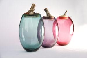
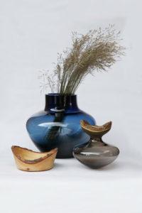
Stacking vessels from Utopia & Utility
I cannot wait to see the vastness this colour will bring into the world of interiors. Follow and subscribe to my blog to know more.

