In continuation to my earlier post 2016's Colours of the Year, I feel that there are some unexpected color palettes to explore in the year 2016.
RED is definitely having a comeback this year. It has already started showing early signs in the fashion week and introductions in the fashion industry. I think that this classic shade will never be out of style. "Pairing" it with cloud grey would give some amazing results to your interiors. The barely there neutral is going give a very supporting background to the bright red tone which will create a great contrast and make it stand out.

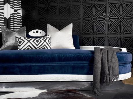
Navy blue is going to be an excellent color to pair with Serenit y. An addition of silver grey along with Navy blue and serenity is going to create a stunning impact on interiors.

Jewel tones - rich colours like the gemstones! Jewels may be for personal adornment, but jewel tones give a room 24-carat panache. These tones are meant to pop in the eyes of viewers. In general, a jewel tone is very bold, and it exemplifies the classic color associated with a particular gemstone. I feel that the colours to watch out while doing interior styling would be Emerald Green, Hot Pink & Sapphire.


And lastly WHITE. I was largely expecting white to make it this time as the Pantone Color of the Year. Layers of white is intriguing. It helps to create shadows, show textures better and silhouettes in a space. I had also mentioned earlier last year on some colour trends anticipated in 2016. Some feel that white may be boring, but have you ever been in a space with only 1 - 2 colours but it seemed that there were 20? Tone on tone or layering is one of the easiest to do with White. A decorative technique that takes a single or a few colours and uses different saturation of that color(s) throughout the space. The result is a room that can be dramatically transformed just by lightening or darkening of that color. If you are happy with the color of your space, but would like to give it more definition and style, look at the picture below that can change your space with tone on tone color using White color.


Change up your space now by exploring the above colours; you will be pleasantly surprised at the outcome.

