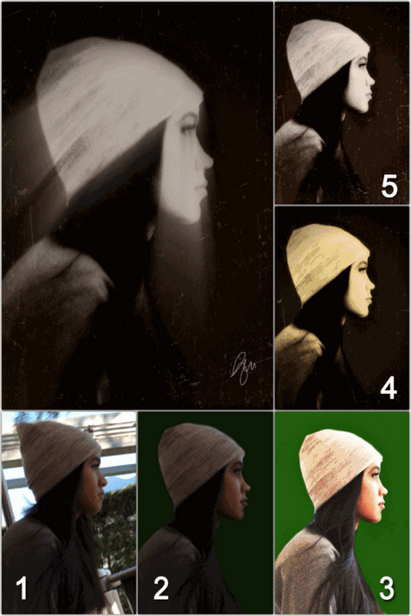
Here is a walk-thru of a recent edit.

1. Original image shot of young woman on tram going to Disneyland with ProCamera.
2. Moved image to Sketch Club where I sculpted her face a bit by painting in a dark green background. I also added more color to her lips and dark shadowing around her eyes with a paintbrush on a separate layer.
3. Moved into Snapseed I adjusted contrast and exposure.
4. Next into Old Photo Pro for an antique look
5. ScratchCam FX provided the added texture
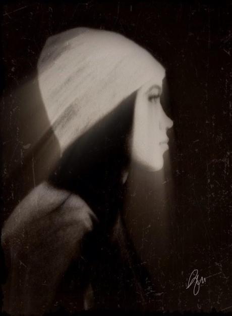
6. Finally into Rays to add the “shine” to the portrait
Here is the finished image

