It seems a pompous title for a post about fonts, but that’s really what this post is about. Fonts.
Whether we like it or not, the online world has become a huge part of the human experience. There’s still playtime, and art, and books, and pro wrestling, of course– but even those special industries are seeing a transition into the digital age. We are slowly translating their powerful presence into invisible 1s and 0s.
And it’s a good thing.
It’s scary, and it’s confusing, and so often we find ourselves out of balance– but it is, overwhelmingly, a good thing. We are making more and more of life accessible to more and more people every day. This is a golden age of information, global insight, and a web of constructed human thoughts that is unlike anything we’ve ever seen before.
And we do see it.
The web, for all its inhuman neurons and missing limbs, is a primarily visual platform. We experience it with our eyes more than anything else.
This is why typography is so important.
Typefaces are our building blocks– subtleties in the architecture of our digital human interactions. In this world, visual aids like fonts are the basis of our thin-slicing, acceptance, judgement, and connections. They change the shape of our living web.
The internet community is endlessly humored by geek rage, and the idea that anyone could get worked up over a font. I get it. I really do. A font is such a simple thing.
Much like a vote.
Or a seat at the front of a bus.
Or a wall.
Dramatized? Yes. The point here is not to equate well-used fonts with civil rights movements, it’s just a reminder that simple things often carry big consequence. It’s a reminder that sometimes only a small group of people are standing at a vantage point where they understand the significance of a seemingly small cause. It’s a reminder that perception is a pervasive and core element to everything we do.
Offline, we say that it is not just what you say, but how you say it, and how it makes someone feel.
Online, we say the same. Only here, the “how” does not refer to tonality and pace– it refers to serifs, colors, shapes, kerning, and other things you might not ever want to know about. Fonts are the centerpoint of influence in these online perceptions.
In other words, if the message matters, the font matters.
If the message doesn’t matter, don’t waste precious space in our new frontier with it.
We’re building the internet. Use materials that shape us into something awesome.
________________________________
How to Determine If You’ve Selected the Right Font
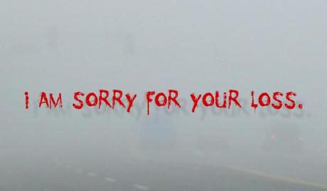
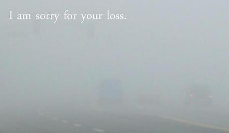
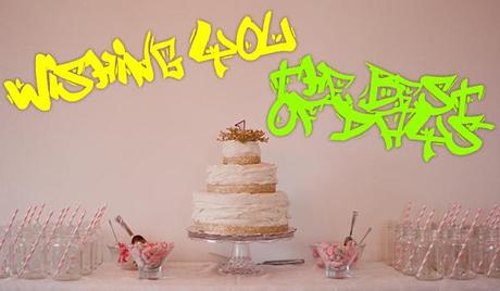
Method 1 – The Greeting Card
Think about the message you are trying to convey. Summarize its core message in a few words. Imagine the scene in which it would flourish.
Now imagine a greeting card– a beautiful, full color, glossy card that features a perfectly compatible scape. Imprint your summarized message on the front.
How does it look?

- Grossly inappropriate?

- Mediocre, if not particularly effective?

- Plain, but effective?

- Illegible, and perhaps more a reflection of you than your point?
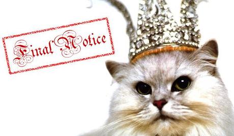
Method 2 – The Cat
Really look at your font. Ignore your message. If your composition was absolutely required to be accompanied by a photo of an internet cat, would that cat also be a compatible fit for your message?

- Is it perhaps too formal?

- Is it maybe too childish?

- Would anyone be able to relate?

- Are you shouting?
In the right context, any of these fonts can find their way to their perfect home. There’s all manner of thoughts and ideas in the ‘verse, and I really do believe each has the perfect font companion.
It’s just a matter of searching, and the searching is just part of taking your part of the web seriously.
As you should.
You are more than just an internet tinkerer.
You are an architect, laying forth the blueprint of our global reality.
Build wisely.
_____________________________
This is an old post that has been languishing in drafts for quite a while, but since I just recently outed myself as a Papyrus-font-hater, I thought I’d dig it up.
Other than smart font choices, what else can we do to build a better internet?
