I hope you all have enjoyed our wedding recaps.One last final wedding detail that I didn’t get to touch very much on is our wedding invitations.
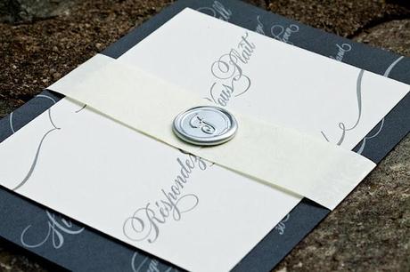
We spent an incredible amount of time on them.So much so that I thought they served their own separate post.
Our inspiration for the invites came from this picture.
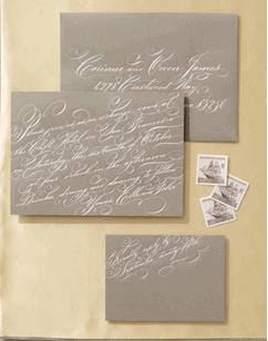
And I have absolutely no idea where I got it from.It was pre-blogging days.
I love love love fancy script font and I was absolutely obsessed with the light font on dark paper.The only minor hitch with this light on dark concept is that traditional printing methods wouldn’t work.I would either have to use thermography (which hardly anyone offers) or letterpress.After doing some due diligence, I found an affordable letterpress printer that was willing to work in our budget, Twin Ravens Press.
We were able to stay within our budget because we opted to do most of the leg work ourselves.I hired an affordable calligrapher, Michele Clark.I made the belly bands, wax seals and envelope liners.We provided Twin Ravens with the paper.I packaged everything together and sent them off.If you are willing to put in some of your own time and effort, you can definitely splurge on the printing.
We were also able to maintain our budget because we opted out of the bulky pocket folds and extra inserts that are so popular now.I’ve never been a fan of the pocket invites (just personal preference. I think it takes away from the invite and isn’t as elegant).As far as the inserts go, our guests already knew accommodation information and directions because they were provided on our wedding website that was distributed on our Save The Date.Besides, no offense to any of you doing these, but anytime I get extra inserts I just throw them out.I own a GPS and a computer.I can figure out directions and accommodations without the extra index card.
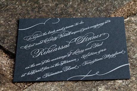
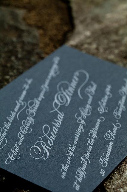
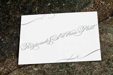
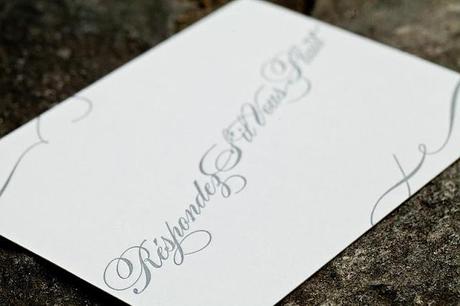
So as far as the design went, we told Kirsten, the owner of Twin Ravens Press, that we wanted to go with this silver on silver calligraphy motif.She suggested that we go a little darker on the paper because she was afraid her silver ink wouldn’t appear on anything too light.She also suggested that we use regular ivory letterpress stock for our RSVP cards so that guests could actually write on them. Smart move and definitely something we wouldn’t have thought of without Kirsten.
We stuck with the calligraphy font and diagonal slant from the inspiration.But we opted to add some swirls at the top and bottom.
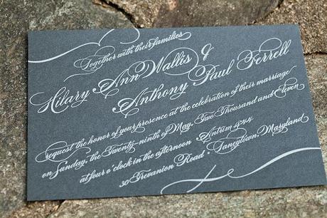
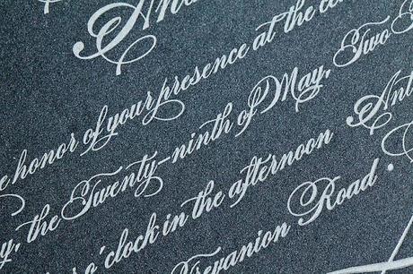
In order to maintain some style consistency and keep the price down, we also asked Kirsten to print our Rehearsal dinner invites.Their designed mimicked our main wedding invite which we loved.
For the RSVP, we decided to use the same repeating swirls from the main invitation.On the front, we put “Response Si Vous Plait” in the same calligraphy font.
On the back side, we used the same monogram that we had for our Save The Date (it was repeated in several other places throughout the wedding—our programs, our menus, our out of town bags).
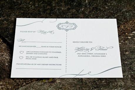 In order to reduce confusion about the dreaded plus one situation, we included the line “We have reserved __ in your honor.”
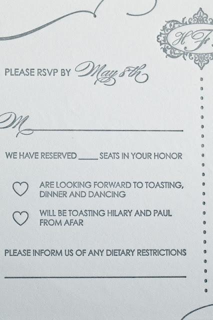
We also wanted to use some cute line for the attend and decline language.For the yeses, we used “are looking forward to toasting, dinner and dancing.”For the nos, we used “will be toasting Hilary and Paul from afar.”I loved the hearts that we preceded these with.A few people even colored them in.
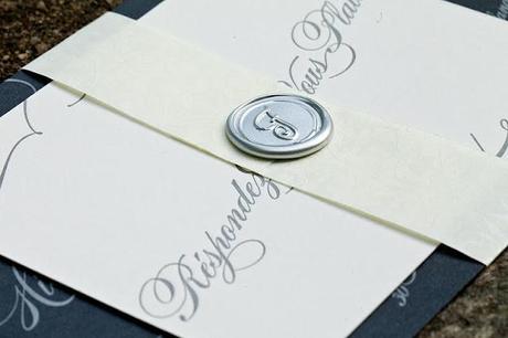
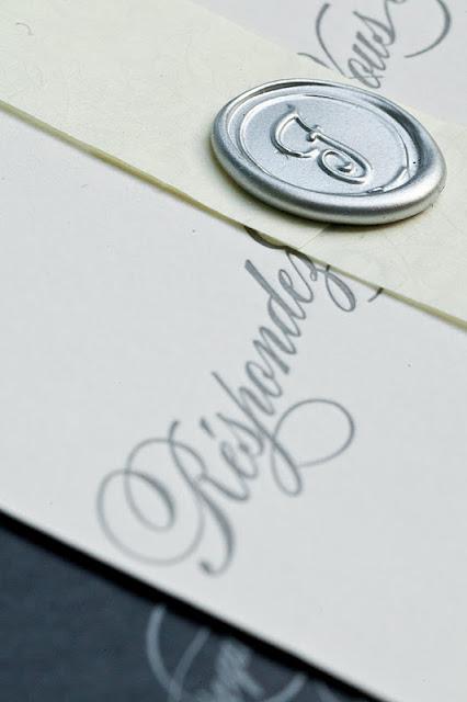 For the belly band, I used paper from Paper Source and simply cut out long strips.I made the wax seals using a glue gun and then spray painted them silver.
 I repeated the paper from the belly bands for the envelope liner.These were super easy to cut out and glue in.I highly recommend this little add on.I think it makes a world of difference.
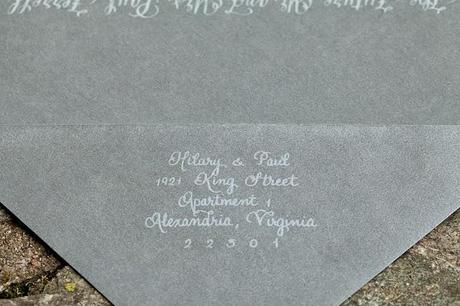
For the return address, we asked our calligraphy to send over a sample to Kristin.Kristin then letterpress the return address onto the envelopes.I think it was like 50 cents an envelope, which was much cheaper than having our calligrapher do them.
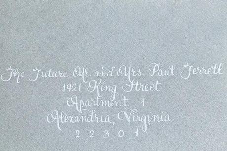
The calligraphy for the addressing was one of my favorite parts of the invitation suite.I have a serious sore spot for calligraphy.Michele, our calligrapher, used silver ink to write the addresses.She did an amazing job and her prices are out of this world.I highly recommend her.
I am still really incredibly proud of these invitations.I think they look like a million bucks and we definitely didn’t pay more than a few hundred dollars for everything.They are some of the most unique wedding invitations I’ve ever seen.Very different from the trending embossed, pocket fold giants.But they are perfectly our style.Unique, elegant and timeless.
What do you think?
